Fin.Bud - Financial Decision Buddy

❓ The Why
Young adults globally face economic challenges due to student debt, unemployment, and unforeseen events like pandemics. To enhance their resilience, this project involved developing a digital solution that analyses users' spending habits to determine optimal decisions within their budgets.
👤 My Role
Group Lead, User Research, UI/ UX Design, User Testing
🛠️ Tools
Figma, Miro, Adobe Illustrator, Microsoft Forms, Adobe Premiere Pro, Adobe Photoshop
🤝 Collaborated with
2 Psychology students for UX Research
1 Computer Science student for
Software Prototype
🔎 Results (from user testing)
-
Participants stated that the product was helpful with cognitive offload and encouraged critical thinking when making purchasing decisions.
-
The design helped boost confidence in decision-making and the shopping made the process more entertaining.
-
The design sheds light on possible approaches to applying virtual AI assistants to improve skills when resources are lacking (time, location or expertise)
🏅 Award
-
Shortlisted for CHI 2023 Student Design Competition where the design project was presented during the CHI 2023 Conference.
-
Research Paper has been published as an Extended Abstract proceedings in the ACM Digital Library.
Project Overview
To watch a quick 5 minute overview of the project, watch the video below. To learn more about the process, keep scrolling!
INITIAL RESEARCH
UN's Sustainable Goals & Previous Research findings
The brief of the module project and CHI design competition was to design a solution linked to one (or more) of the 17 Sustainable Development Goals (SDGs). As a team, we decided to focus on two of these goals:
4: Quality Education
Ensure inclusive & equitable quality education and promote lifelong learning opportunities for all
1. No Poverty
End Poverty in all its form
everywhere
Research showed:
-
Youth employment rate in the UK have risen to 14.9% due to the pandemic
-
Only 38% of children & young people in the UK have been taught financial education at school.
Insufficient financial education puts young adults at a disadvantage, leaving them unprepared to handle unforeseen financial challenges. This issue extends beyond developed nations like the UK, raising concerns about the impact on countries worldwide lacking these essential educational resources.
Therefore we aimed to:
Raise the overall financial well-being of young adults to prevent them from falling into poverty
User Research: Survey
To identify the particular struggles young people face, a user survey was conducted with 62 young adults between 18 and 29 across Europe and Asia.
Consent was provided by the participants to be part of the survey, except for participants below the age of 18 due to the age of consent.

The survey explored...
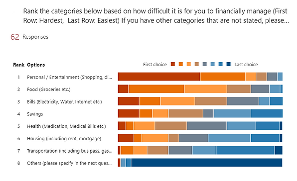
🔎 What young adults spend the most on each month

1. Housing (Rent) | 2. Food (Groceries) | 3. Personal/ Entertainment
🔎 Young adults' perception of their own spending behaviour
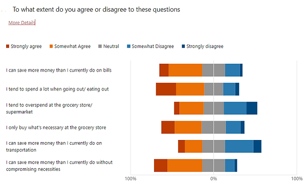
Majority of participants believe they overspent when they're out & believe they can save more than they currently do
1. Personal/ Entertainment | 2. Food (Groceries) | 3. Bills ; due to the lack of self-control/ planning
🔎 Reasons why young adults don't/ stopped managing their finances

1. Too difficult/ complicated | 2. Don't know how | 3. Too much work
🔎 What young adults wish they knew earlier about financial management
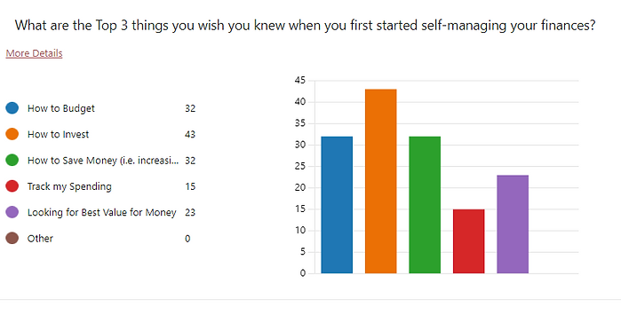
1. How to invest | 2. How to budget | 3. How to save money (increase savings)
This opened up further questions, leading to....
User Research: Follow-up Interviews
5 online interviews were conducted (1 per team member) to ask follow-up questions and to gather more insight into young adults' struggle and expectation of digital apps.
"Why do young adults find
it difficult to control
their spending?"
"What do young adults look for in a digital app?"
"What about financial management is difficult/ too much work?"
"How can we make budgeting & financial management easier? "
Synthesising the information: Affinity Mapping
Using the results from the user survey and interview, I created an affinity map to organise the information and find overlapping themes. This helped to define the user persona, user requirement & design direction.

Insights showed that participants struggled with financial management due to...
❌ Lack of efficient tracking strategy
Most of our participants frequently forget to record and track their spending.
❌ The struggle to balance needs and wants
Participants struggled with determining the boundary between fulfilling their desires beyond necessities.
❌ Inability to properly evaluate all the options available
Participants often made judgments without well-justified reasons, for instance, several participants mentioned irrational purchasing due to discounts or thought they might need it one day while ignoring the real need.
Based on the insights, my team and I agreed on a...
Product Goal:
To develop a financial management solution that:
✔️ Addresses the challenges of inefficient spending tracking
✔️ Assists users in distinguishing between needs and wants
✔️ Provides informed evaluations of available options, enabling
users to make conscious and rational purchasing decisions
aligned with their actual needs and long-term financial goals.
Persona & User Requirement
A persona along with their user requirement was then created to better visualise the target user and their needs. Nelson's Usability Heuristics was incorporated within the user requirement to ensure that the final design fit usability guidelines.

User Requirement
✔️ Informative and functional
Suggestions need to be explainable and well-justified.
✔️ Trustworthy and Personalised
Whatever our product would be, it needs to elicit trust from users and know them well.
✔️ Easy to use
The support and suggestions need to be easy to understand and straightforward.
✔️ Entertaining
The interaction needs to be engaging and fun.
✔️ Aesthetically pleasing
The interfaces need to be aesthetic yet clean.
✔️ Innovative
The interactions need to be creative.
IDEATION
Existing Products
Since we already had a product goal, we decided to further explore currently available apps on the market that have tackle the problem. Our survey showed that 70% of participants who keep track of their spending relied on mobile financial apps, therefore we analysed popular financial tracking apps.
One particular app stood out...
Fortune City

The app assists users in monitoring spending categories, offering monthly reports for budget tracking, and employing a gamified approach by allowing users to build a city with each logged expenditure, encouraging financial planning.
Strengths
✔️ Gamification aspect provides motivation to self-track
✔️ Aesthetic Pleasing
Weakness
❌ Manual input is required, potentially leading to inaccuracies, user forgetfulness, or decreased interest due to the additional effort involved.
❌ The gamification feature could be seen as a motivator to spend more to add more buildings to the city.
Since participants also highlighted eating out and grocery shopping as the hardest to manage, we research into current apps which assisted users in those areas.

Most apps supported users with grocery planning, and finding discounted groceries & restaurants.
However...
None helped users with making optimal decisions, opening a gap for us to fill.
Design Direction:
A user-friendly and intuitive interface that gamifies the financial tracking experience, ensuring user engagement, while guiding users in real time to make optimal spending decisions.
Crazy 8's
To start the ideation process, I facilitated a Crazy 8's session to help the team brainstorm ideas. This helped us to come up with a variety of solutions.

At the end of the design stage, each team member presented their 8 ideas, while the rest of us provided our feedback on the ideas. Each member then selected their top 5 ideas.

The chosen ideas were evaluated against the user requirement using a criteria matrix to find the design that meets the product goal the closest.

The 3 ideas with the highest votes & highest evaluation score were:
⭐ Affective Robot Dog*
Emotionally responsive Robot Dog offering real-time feedback through physical interactions and facial expressions, featuring an interface for users to assess their spending decisions.
⭐ Simulation Game
Gamifying the processes and outcomes of decision-making. When users save money in the real world, they will get an equal amount of in-game currency that can be used to build and decorate their virtual house and garden.
⭐ SPENDSMART*
An AI learning system that analyses users’ spending habits through their purchasing history (bills, receipts, budgets, and preferences), then providing personalised suggestions for improved decision-making aligned with their goals.
*Idea that I generated
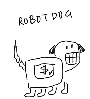
The Affective Robot Dog was rank the highest among the team members as it made the support process more interactive and fun for the user.
However, it was lacking an educational aspect and long-term engagement. Therefore, the simulation game & SPENDSMART concept were combined into the robot dog.
Storyboarding & Initial User Testing
To test the concept of the initial design, I drew out a storyboard mapping the user journey.

Core Concept:
A physical robot dog with an interactive face follows the user in-store and tracks their behaviour through a built-in camera. When users make suboptimal decision, it'll provide real-time suggestion through physical and visual interactions.
The storyboard was then tested with 5 participants individual through online interviews.
Results showed:
✔️ Participants liked the concept of 'an animal consultant'
✔️ They favoured the affective design
However,
❌ The design is too excessive and flashy in public, leading to privacy issues
❌ Having a physical robot dog that followed users around could be "annoying"
❌ Cost Affordability.
Based on this feedback, I decided to further develop the design to be more
Portable and Affordable
DEVELOPMENT
Concept Update
I sketched out my redesigned idea on paper & ran through the concept with my team. I also modified the storyboard to reflect the new hybrid concept where the phone app is paired with moveable ears and a camera necklace to track the user's shopping.


The team responded positively to the developed idea and believed it aligned better with users' previous feedback.
Paper Prototype
Quick and rough paper sketches were used to experiment with different formats and layouts for the home screen & the screen users would see when they shop using the app.

The sketches highlighted in yellow were chosen as the layout provided clear information segregation, making it easy to view at quick glance.
Digital Wireframes
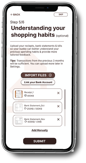
Using the paper wireframes, I've blocked out the layout and the text for the app, starting from the onboarding phase of the app to ensure that users understand the app process and to test if the flow made logical sense.
Onboarding Flow
When users log in for the first time they would go through the onboarding flow where the AI will get to know the users' preferences and past spending behaviour.

Here I prioritised step by step instructions to guide the user at each step of the way. Indicators were added to keep users inform on where they were in the onboarding and how close they were to completing it.
Users were also given the option to personalise their financial decision buddy avatar, allowing them to better connect with their buddy.
Home Screen & Equipment Setup
The purpose of the home screen is to show high level information about the users' spending habits and to help users gauge their future spending habit.
During in-store shopping, the app is set up to help users track their shopping cart & help provide decision feedback in real time.

The design is based around users' selected financial decision buddy which not only welcomes users onto the app, but also guide users during their decision making. This provides a face to the AI which makes it more trustworthy.
Cart Interface
Users are presented with their pre-loaded shopping list and are shown their support buddy on screen. Depending on their risk to going overbudget, the avatar's face would change according.

I wanted to keep it's visual indicator clear and easy to see while shopping. Bold colours and bars were used to help users easily check if they're within budget or if something needs to be modified.
Team Feedback
✔️ Pages are intuitive & straightforward.
✔️ The colour bar indicators & facial expressions were easy to notice and understand,
❌ The list on both sides of the cart interface can be overwhelming: too much text
cramped into a small space.
❌ Prompts on the cart interface to let users know that they can click on their decision
buddy for information or dismiss it if needed.
High-Fidelity Prototype
Since aesthetics was a key app appeal, the app's visuals needed to be as close to the final product during the user testing to be able to properly evaluate it against the user requirements.
Prototype Flow
To simulate the whole user journey, 5 features were prototyped & linked: Onboarding, Homescreen, In-Store Shopping Cart, Shopping feedback & Incentives. This was done so that when users test the app it would feel like the real app

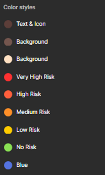
Colour Scheme & Style
The colours are kept neutral and warm to be more inviting, while maintaining an outlined and rounded corners to give it a playful vibe. I also created an avatar to build affective interactions and elicit trust along with 5 different emotions to help users easily visually the risk.


FINAL PROTOTYPE DESIGN
Below are the final clickable prototypes to be used during user testing.
Onboarding Flow
The onboarding screens were kept minimal and clean to make the instructions clear and focused. Users also have the option to skip if they don't feel comfortable answering a question.

Home Screen & Spending Analysis
To maintain a playful and lively vibe, vibrant and high contrast colours were chosen for improved visibility, particularly for users with visual impairment.
The interface were also kept highly visual, incorporating clear labels to make the information easily accessible and digestible


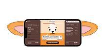
Support Buddy Function
Text were made larger and less text were crammed on the screen for quick visibility. Colours were also used to highlight important information such as products which were not budget optimal to draw users' attention to it. To help users with the decision making, alternative products were also shown visually to help users identify products.
The physical ear casing would also move according to the avatar's mood. If happy, the mechanical ears would point up, and would droop as the avatar's mood drops.


Incentive & In-App Community Game
Users gain varying amounts of in-app coins for their decision making performance after they checkout their in-store cart. These coins can be then used to upgrade their decision buddy’s home, whilst also visiting other friends’ house. This was to create an incentive for users to use the app long-term with friends.


View the Interactive Prototypes here
Note: The prototype works optimally on mobile as the device needs to be rotated in portrait and landscape mode which cannot be done on Figma's web prototype view.
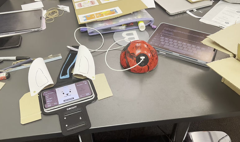
Physical Prototypes for User Testing
A Wizard of Oz Route was used to test our prototype. The app's interface had mechanical ears made out of cardboard & card & were manually moved during the session, while the logic behind the app was coded on a PC & screenshared onto a phone to mimic:
🛒 The items participants' put into the cart
🛒 The price of participants' current cart
🛒 The risk of going over budget using the avatar's different facial expressions and colour levels.
USER TESTING
User testing was conducted in-person with 5 participants & were broken down into a 3 part session.
Participants were briefed before the session and filled in a consent form.
Part 1: Shopping task based participants' own ability (control condition)
Participants were placed in a mocked supermarket scenario where they completed a shopping task for a persona. They were given the persona’s budget, needs, and preferences, and show a variety of items ranging in cost and quality. Participants had to identify the items that would not only fit the budget but also make the persona as happy as possible. This was completed without the prototype to see how users would shop in a regular setting with a set budget and with personal preference.

Part 2: Click-through test
Participants did a walk-through of the app using a mixed fidelity interactive prototype. This helped participants better understand how the app works and to assess if the user flow was intuitive.
I was in charge of facilitating the session, asking the participant about their thoughts & feelings of the app, and encouraged them to think out loud.

Part 3: Shopping Task using the App
Participants re-did the shopping task in Part 1, but for a different persona whilst being assisted by the app. We simulated this using a Wizard of Oz method. One team member observed participants, while the other two members controlled the software and Apple Watch to simulate the behaviour tracking function .
When the avatar’s emotion dropped, participants could use the “Ask” button for suggestions provided by another team member. At the end of the mock shopping, participants were provided with a verbal report of their performance, including brief feedback and an analysis of their decisions based on the decision analysis strategy.

User Feedback
Participants were interviewed after the user testing and asked to rate the prototype against an evaluation matrix.

What went well:
✔️ The prototype rated 85% against the criteria matrix.
✔️ The design helped boost participants' confidence in decision-making and made the process more entertaining.
✔️ The ear extension attracted participants’ attention effectively, while the avatar’s emotions pushed them to think more
critically about their decision.
✔️ Participants said the product would motivate them over time to build better spending habits.
✔️ Interface was visually appealing and easy to understand. Information was also clear and straightforward
Future Improvements:
❌ Text font might need to be bigger so it can be easier to see for some users.
❌ Two participants preferred real-money incentives over gamification rewards
❌ One participant stated they might become over-reliant on the app, instead of learn from it.
Future Design:
-
Design different levels of “challenge” depending on how much assistance users require from the system.
-
Provide better incentives such as cash or shopping vouchers to motivate users to’ level up’ to higher self-dependency.

